Jekyll2026-09-15T22:16:32+00:00https://gabrielkasmi.github.io/feed.xmlGabriel KasmiML scientist working on explainable AI, computer vision, and remote sensing for energy systems.Gabriel KasmiNavier–Stokes, Scaling Laws, and Peak Tokens2026-09-15T00:00:00+00:002026-09-15T00:00:00+00:00https://gabrielkasmi.github.io/blog/2026/09/15/scaling-laws-navier-stokes
Much has already been said about the OpenAI Navier–Stokes affair — about the credibility of the method itself (does the model actually reason, or is this brute force dressed up as insight), and about the credit dispute with the mathematicians who were working the same problem. One detail, though, is worth dwelling on longer than the rest of the coverage has: OpenAI's own admission that "while unlikely, [it] cannot rule out that de-identified data derived from their usage of our products helped improve our models."
Behind that sentence sits a fairly simple fact: any AI model needs good data to keep improving. The public conversation about AI's limits keeps circling around an energy wall, or a valuation bubble. But what if the real binding constraint is something narrower and more specific — tokens — and what if, for this particular resource, the race to the frontier is set up to cannibalize itself?
1. Data is all you need
At first order, progress in these models has depended on scaling two things together: compute and training tokens. Very roughly speaking, for each additional parameter, 20 additional tokens are needed.
This arithmetic quickly exhausted the internet. Current models are already trained on the whole internet. It's worth noting, in passing, that the other commonly discussed constraint — energy and compute infrastructure — is the one the industry actually knows how to throw engineering at, however extreme: Google and SpaceX are jointly developing Project Suncatcher, orbital data centers running on continuous solar power, targeting deployment as early as 2027. There is, notably, no equivalent engineering fix for a shortage of genuinely new ideas. You cannot launch a satellite to go fetch a thought that doesn't exist yet.
2. The law of receding tokens
With the open internet drained, the hunt has moved to other reservoirs: open data commons that were never built to withstand this kind of load. Wikimedia has documented a 50% surge in bandwidth demand on Wikimedia Commons driven by AI crawlers; The Register names Meta and OpenAI specifically as the worst offenders. The same pressure is reported anecdotally around other open infrastructure — OpenStreetMap and Zenodo among them — maintainers describing a need to defend against "excessive automation" alongside legitimate use.
But the open commons aren't the only reservoir left to mine. The Navier–Stokes episode reveals the next one: users' own prompts. If interactions with a model can measurably improve it, then prompts are training data too — original, unpublished, often more valuable per token than anything left on the open web, precisely because they capture reasoning that has never been written down anywhere else. The question this opens isn't legal so much as reputational: once people understand this is happening, how will it be received?
3. The clock is ticking
If the pool of good prompts is the last frontier, it's also a strikingly fragile one, for at least two reasons.
First, an eviction effect: people with genuinely original ideas may simply stop feeding them to a tool, once the Navier–Stokes precedent is out there. This isn't a hypothetical reaction — the mechanism has already been measured elsewhere. After the Snowden revelations, Jon Penney's study of Wikipedia traffic found a measurable drop in visits to sensitive topics, driven purely by the awareness of being watched, without any actual enforcement action ever taking place. There's no reason to expect researchers and domain experts to behave differently once they suspect their brainstorming sessions might be harvested.
Second, a structural response: the growth of self-hosted, open-weight models will likely absorb a growing share of exactly this kind of high-value brainstorming, run locally and never reaching Anthropic's or OpenAI's servers at all.
Francisco de Goya, Saturno devorando a su hijo (c. 1820). Public domain (Wikimedia Commons).
OpenAI's celestial naming scheme is well chosen, incidentally — Terra, Luna, Sol. A fitting next name for GPT-6.1 might be Saturn: the Roman god who devoured his own children. More fundamentally, though: it's worth asking whether the deposit of usable data needed to train the next generation of these models might run dry before the data centers meant to train them have even finished being built.
]]>Gabriel KasmiHidden in Plain Sight2026-09-04T00:00:00+00:002026-09-04T00:00:00+00:00https://gabrielkasmi.github.io/blog/2026/09/04/hidden-in-plain-sight
Like most people, I had used OpenStreetMap for years without ever really understanding the idea underneath it. It was just "the open Google Maps", with a lot of large systems already referenced in Europe.
It took a weekend at State of the Map to realize that OSM rests on two core principles, far more interesting than the map itself.
The first: you only map what can be seen. OSM records what is observable to anyone standing in a public place: a road, a roundabout, a building's footprint. The second: the map cannot be appropriated. It's a commons. No company, no state, no individual can enclose it. Everyone contributes, everyone benefits, and the thing itself belongs to no one.
Two modest-sounding rules. I've come to think they're the answer to a discomfort that keeps coming up in my own work, and in a debate I watched at the conference.
Panoramax, or: we put photos on the internet
One of the flagship projects in the room was Panoramax, an open, community-run alternative to Street View. Volunteers capture street-level imagery and publish it openly for anyone to use.
And immediately, the uncomfortable question: we are photographing streets and putting them online. A parked car that moves at a certain hour tells you someone has left home. Multiply that across a city, point modern AI at it, and you extract a lot that people never meant to share. So, do we want to enable that?
It's a fair question. But notice where it bites. The car was on the street, in plain view, the whole time. The imagery didn't create the information; it made it easier to collect at scale. The line that matters isn't between taking the photograph and not taking it — it's between taking it and misusing it.
"You're going to look inside people's homes"
I recognize that discomfort because it followed me all through my PhD. Every time I described mapping rooftop solar from aerial imagery, someone would say some version of: aren't you going to look inside people's homes?
It's the same worry as Panoramax, wearing different clothes. A solar panel on a roof is visible from the sky, and it always has been. What changed is that a model can now find all of them, everywhere, cheaply. The instinct, in both cases, is the same: this feels intrusive, so maybe we should keep the data closed.
The counter-intuitive part
Here's the thing about closing a dataset of something already visible: it doesn't hide the phenomenon. It only decides who gets to see it.
The rooftop is still there. The street is still filmed by every passing dashcam. Locking away the map doesn't remove the capability — it concentrates it in the hands of whoever can afford to rebuild it privately, while denying it to the researchers, local authorities and citizens who would use it in the open.
Cryptographers have a name for the mistake this avoids. Kerckhoffs's principle says a system should stay secure even if everything about it except the key is public. Security that depends on nobody knowing how the system works isn't security — it's a fragility waiting to be found.
Translate that to infrastructure data and it reads almost the same:
A system you have to keep secret to keep safe isn't safe, it's fragile. What's robust is what everyone can see, check, and correct.
This is where OSM's two principles click into place. Map only what's visible, and you're not building surveillance — you're describing what is already public. Make it inappropriable, and no single bad actor gains an asymmetric edge, because everyone holds the same map, including the people who would spot and fix its errors. You regulate the misuse, not the looking.
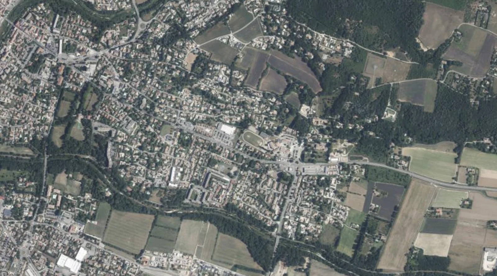
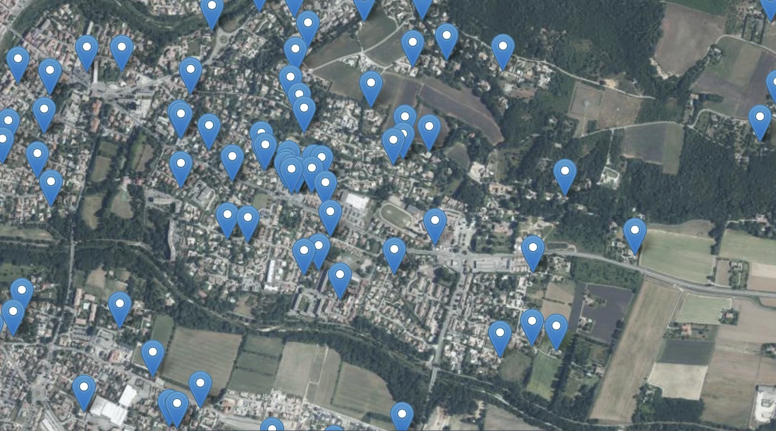
It was there all along — drag the slider to reveal the detected rooftop PV. Detections over Montélimar, from deeppvmapper.fr.
The case for open PV mapping
This isn't abstract for me. Rooftop solar is a near-perfect example of something hidden in plain sight: visible from space, yet largely missing from the official registries meant to track it. In several countries the gap between what's installed and what's recorded runs into the tens of percent.
You can close that gap two ways. You can buy exclusive high-resolution imagery, run it privately, and publish a number nobody else can reproduce. You get a figure standing on sand, trustworthy only as far as you trust the people who made it. Or you can do it in the open.
That's the bet behind EarthPV and DeepPVMapper: open imagery, open models, open data, and a crowdsourcing loop where anyone can verify a detection and feed the correction back in. The map isn't weaker for being public. Every extra pair of eyes that checks a panel, every community that corrects a boundary, makes it better. It's a public good in the literal sense: it gains value as more people use it.
I'm not trying to settle the grand "should data be open or closed" debate. My point is narrower, and I think harder to argue with: for infrastructure already visible from the sky or the street, the real choice was never "seen or hidden." It's "seen by a well-resourced few, or seen — and correctable — by everyone." Openness isn't the risky option here. It's the robust one.
]]>Gabriel KasmiThe Blind Men and the Solar Panel2026-08-15T00:00:00+00:002026-08-15T00:00:00+00:00https://gabrielkasmi.github.io/blog/2026/08/15/three-maps-three-definitions
MapYourGrid recently opened a proposal to overhaul how power generation and storage are tagged in OpenStreetMap. It's the first real revision since 2013, when the current scheme — was put in place. On the surface it's a fairly dry tagging debate: new keys for source, method, technology, the ability to chain generators together, explicit roles like main, backup, auxiliary, standalone, a proper way to describe storage.
This debate is not only a question for cartographers. Every convention defines what a map is capable of showing — and, by construction, about what it can't. A registry, a satellite pipeline, and a crowdsourced map are not just three ways of drawing the same picture; they're three different answers to the question of where our blind spots sit when we try to monitor energy infrastructure. Get the object definition wrong, or leave it implicit, and the blind spot doesn't disappear — it just becomes invisible to whoever is relying on the map.
Photovoltaics is a good illustration, because it's far less simple to define than it looks. And the fact that OSM's own community is still renegotiating this, more than a decade after the last attempt, is a signal in itself. The tension we run into when comparing grid-connection data against remote sensing isn't a quirk of our particular pipeline — it's a modeling problem for the object "PV installation" itself, one that resurfaces even inside an open, collaboratively negotiated system built specifically to standardize this kind of thing.
Three groups routinely try to describe this object: grid operators, remote sensing pipelines, and open mapping communities. Each has a real, working definition. Each is right, given what it's built to see. None of them is describing the whole thing.
It turns out PV is the elephant of the old parable — the blind men and the elephant, updated for the energy transition. A grid operator has a hand on the tail. A satellite pipeline is feeling up the ear. A mapper is patting the trunk, in the dark, one contribution at a time. Each comes back with a description that's internally consistent, confidently reported, and completely partial. Nobody is lying. Nobody has the whole animal.
1. A blurry ground truth
Before comparing representations of PV installations, it's worth asking whether the thing being represented holds still long enough to be defined.
Start with the easy case that turns out not to be so easy. Roof-mounted versus ground-mounted looks like a clean line — until you get to solar carports (ombrières). A carport's capacity and design logic sit closer to a power plant: engineered structures, often built and financed at commercial scale. But its injection mode, its ownership, and where it physically sits — a supermarket parking lot, a factory yard — sit closer to rooftop or commercial PV. It doesn't sit on either side of the roof/ground line; it sits on a continuum the line doesn't account for. And it's a useful reminder that capacity or surface area, the two variables everyone reaches for first, aren't always the right axis to classify on.
Then there's the question of what "a plant" even is. The intuitive answer is: a set of arrays, physically grouped, doing the same thing. Fine — but now ask what "a connection" is. Several arrays can sit behind a single grid connection point. Or the same physical site can end up behind two or three separate connection points, depending on how and when it was built out — an extension added a year later, metered separately because that's how the paperwork happened to work at the time. So you can have one connection representing one plant, or three connections representing what is, on the ground, a single plant. Same physical reality, different administrative count, depending entirely on build history that has nothing to do with the electricity being produced.
Layer onto that everything else that compounds before any comparison even starts:
injection modality — total feed-in versus self-consumption with partial feed-in, which can turn one physical system into two distinct administrative records;
installed capacity versus connected (rated) capacity, which routinely differ;
plug-and-play systems — plugged into a wall outlet, producing real electricity, but not connected in the formal sense a grid operator's registry expects. Plugged to the building. Invisible to the connection registry.
And we haven't even gotten to what happens after a system is counted — production estimates, data sharing constraints, the fact that some of this is sensitive or simply private by design, no point de livraison published, no address disclosed. We've merely identified the system. We haven't started doing anything with it. It's worth naming honestly: this isn't a tidy taxonomy waiting for the right specialist to sort it out. It's a cheerful mess.
2. Three representations
Each channel that tries to describe PV builds its own answer to the questions above — implicitly, usually without saying so. Before comparing them, it's worth laying out what each one is actually built to see, and what it structurally cannot.
Grid connection data records an administrative event: a system officially connected to the network, tied to a point de livraison. It captures what has gone through the connection pipeline. It's strong on some attributes — capacity, connection date — precisely because those are what the paperwork requires. It's only as complete as that pipeline: truncation at low-reporting thresholds, registration lag, aggregation choices that hide small or recent systems.
Open mapping works bottom-up: whoever surveys or digitizes a system tags it, at whatever granularity the local mapper chose, under a schema the community negotiates in the open — which is exactly what the proposal opening this piece is doing. Its strength is that it's not gated by any single operator or administrative process; a plug-and-play balcony unit can be tagged here even though it will never appear in a connection registry. Its weakness is the mirror image of that strength: coverage is only as good as who showed up to map it, and it's uneven by construction.
Remote sensing (DeepPVMapper-type pipelines) sees a physical, visual object: pixels classified as PV, grouped into a cluster. It's bound to the date of the imagery — a system installed after the flight doesn't exist as far as the model is concerned — and to whatever the detection and clustering logic decides counts as "one" installation. Worth flagging here, because it matters later: remote sensing is, by construction, exhaustive over its coverage area and globally interoperable — the same method applied to imagery anywhere gives a comparable output, with no dependency on a public operator's registry existing or being any good.
Three honest, internally consistent descriptions. Three different objects.
3. The comparison problem
Given all that, why compare these sources at all? Because each one's blind spot is close to being another one's specialty. Grid data is authoritative on what has been formally connected and when, but blind to everything that hasn't gone through that process. Remote sensing is blind to intent, ownership, and anything installed after the last flight, but doesn't care whether an administrative process ever happened. Open mapping can catch what neither of the other two are built to catch, at the cost of even coverage.
The scale of the mismatch isn't a rounding error. Two examples make that concrete.
Pakistan had imported over 55.7 GW of solar panels cumulatively by the end of May 2026 [1]. Officially net-metered installed capacity, as reported by the distribution companies that are supposed to be tracking it, stood at just 6.5 GW at the close of the previous fiscal year — meaning at least 86% of everything imported never showed up as a formal, grid-tied connection [1]. Some of that gap is inventory sitting in warehouses or installation lag, but a meaningful share is systems that were never meant to touch the registry at all: commercial and industrial self-consumption setups, hybrid inverters paired with batteries, off-grid installations in areas net metering doesn't reach [1]. By 2025, distributed solar — net-metered, behind-the-meter, and off-grid combined — was already estimated to generate the equivalent of nearly half of all grid-supplied electricity in the country, almost entirely outside what the official connection data records [2].
Germany shows the same pattern at a different scale. As of early 2026, just over 1.3 million plug-and-play balcony systems ("Balkonkraftwerke") were formally registered in the Bundesnetzagentur's Marktstammdatenregister [3]. But researchers at HTW Berlin, working from retailer and user surveys, estimated the real number of installed units at somewhere between 1.5 and 4 million as early as February 2025 — when only around 862,000 were officially on the books [4]. Put differently: independent estimates suggest something like a third to half of these systems ever get registered at all, even though registration has been simplified to a fifteen-minute online form since 2024 [4].
In both cases, the grid operator isn't wrong about what it reports. It's reporting what its process is built to capture. The gap is structural, not a data quality problem waiting to be cleaned up — and it's large enough, in both directions, that treating any single source as ground truth would be a mistake with real consequences for grid planning and policy, not just an academic footnote.
4. Toward a shared ontology
None of this argues for a single, unified data source that replaces the others — that's not realistic,
and it isn't the goal. Grid operators need what grid operators need; remote sensing will always be
bound to imagery dates; open mapping will always depend on who shows up.
But if the goal is to avoid double-counting, to actually compare what these sources see,
and to know when a gap reflects real underreporting rather than definitional mismatch, then
some shared reference is worth having — not a perfect one, but one that names the ambiguities
from §1 explicitly instead of letting each pipeline resolve them silently in its own conventions.
An openly negotiated, imperfect ontology doesn't resolve the mess. What it does is give each modality —
grid connection, remote sensing, crowdsourced mapping — a common surface to plug into, so that when
they disagree, the disagreement is legible instead of just noise. This is where the MapYourGrid
proposal earns a second mention. The current revision of the power plants descriptions is
accessible here.
The point was never to find the one true description of the elephant. It's to let everyone standing around it compare notes.
Sources
[1] Business Recorder — Pakistan's solar revolution: phase-two in full swing, July 2026.
[2] Ember — The solarisation of Pakistan's energy economy, June 2026.
[3] 42watt.de — Balkonkraftwerk anmelden 2026: Anleitung für das Marktstammdatenregister, July 2026.
[4] SOLARPUNK — Krasse Dunkelziffer: So viele Balkonkraftwerke gibt es in Deutschland, November 2025.
]]>Gabriel KasmiWhat Does a Solar Panel Detector Actually See?2026-07-13T00:00:00+00:002026-07-13T00:00:00+00:00https://gabrielkasmi.github.io/blog/2026/07/13/wavelets-and-the-grid-detector
When I was developing DeepPVMapper — a deep learning
pipeline that maps rooftop photovoltaic installations from aerial imagery across France — the
question I got asked most wasn't how accurate the model was. It was simpler, and harder:
does it actually detect solar panels?
At first this sounds like the same question. It isn't. A model can score well on a held-out
test set and still be latching onto the wrong thing. Precision and recall tell you the model
agrees with your labels; they don't tell you why. And "why" is exactly what you need before
trusting a model deployed at the scale of an entire country, because the failure modes that
matter — the ones that surface once you leave the validation set and hit a new region, a new
roof material, a new camera — are invisible to an aggregate metric.
Why "what does it see" is hard
The instinctive answer is to reach for an explainability method, get a saliency map, and look
at which pixels the model attended to. I did that. It's the standard toolkit — Grad-CAM,
integrated gradients, occlusion-based attributions — and all of these answer the same question:
where did the model look?
That's useful, but it isn't the question I needed answered. For a model, a solar panel is not
a semantic category — it's a distribution of pixel intensities. What I needed to know wasn't
where a prediction came from on the image, but what kind of visual structure it was
reacting to at that location. Was it the fine, repetitive texture of individual PV cells and
their grid lines? The coarse rectangular outline of the array against the roof? Something else
entirely — a skylight, a water tank, a shadow with the right aspect ratio? None of the existing
pixel-domain tools could answer that. They could point at a location; they couldn't describe
what was there from the model's point of view.
Decomposing the image into scales
This gap is what pushed us to build a new attribution method based on wavelet
decomposition, first introduced as the Wavelet Scale Attribution Method (WCAM), and
later generalized as the
Wavelet Attribution Method (WAM) at ICML 2025.
Wavelets decompose an image into a set of scales — from coarse, low-frequency components (the
general shape and layout of an object) to fine, high-frequency components (texture, edges,
small repeated patterns). Unlike a plain pixel-domain heatmap, a wavelet attribution tells you,
for a given location, which scale of visual information the model's decision actually
depends on.
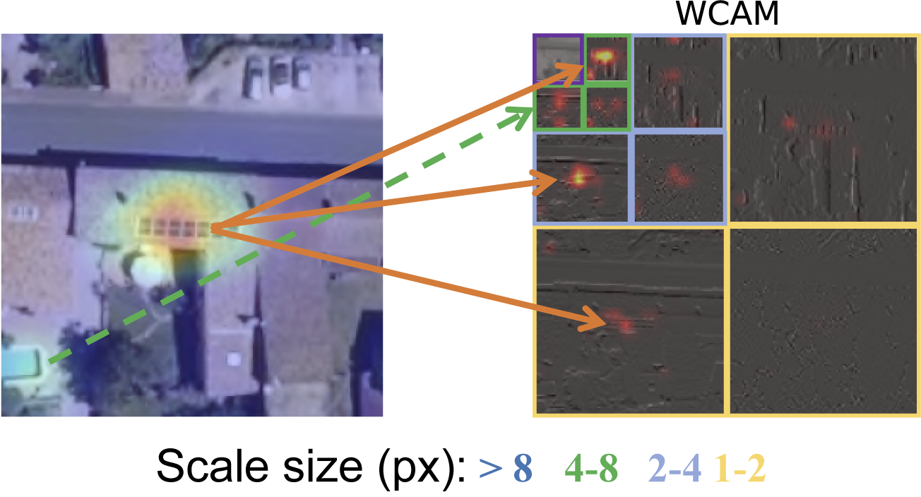
Figure 1. A classic pixel-domain saliency map (left) tells you where
the model looked, but collapses every scale into a single heatmap. The WCAM (right) breaks the
same prediction down by scale band (from coarse structures, >8 px, to fine texture, 1–2 px),
showing exactly which spatial frequency the decision relies on. Source:
Kasmi et al., Environmental Data Science (2025).
Applied to a PV detection, this distinction is exactly what I was missing: does the model rely
mostly on the coarse shape of the array — a dark rectangle on a lighter roof — or on the fine
texture of individual modules and their grid pattern? Two models can produce an identical
bounding box and an identical saliency heatmap while relying on completely different, and not
equally reliable, visual evidence. This matters especially for PV systems, which are themselves
multi-scale objects: the same installation can be described as a roof-sized system, a cluster of
modules, or a few centimeters of grid line, depending on where you zoom in.
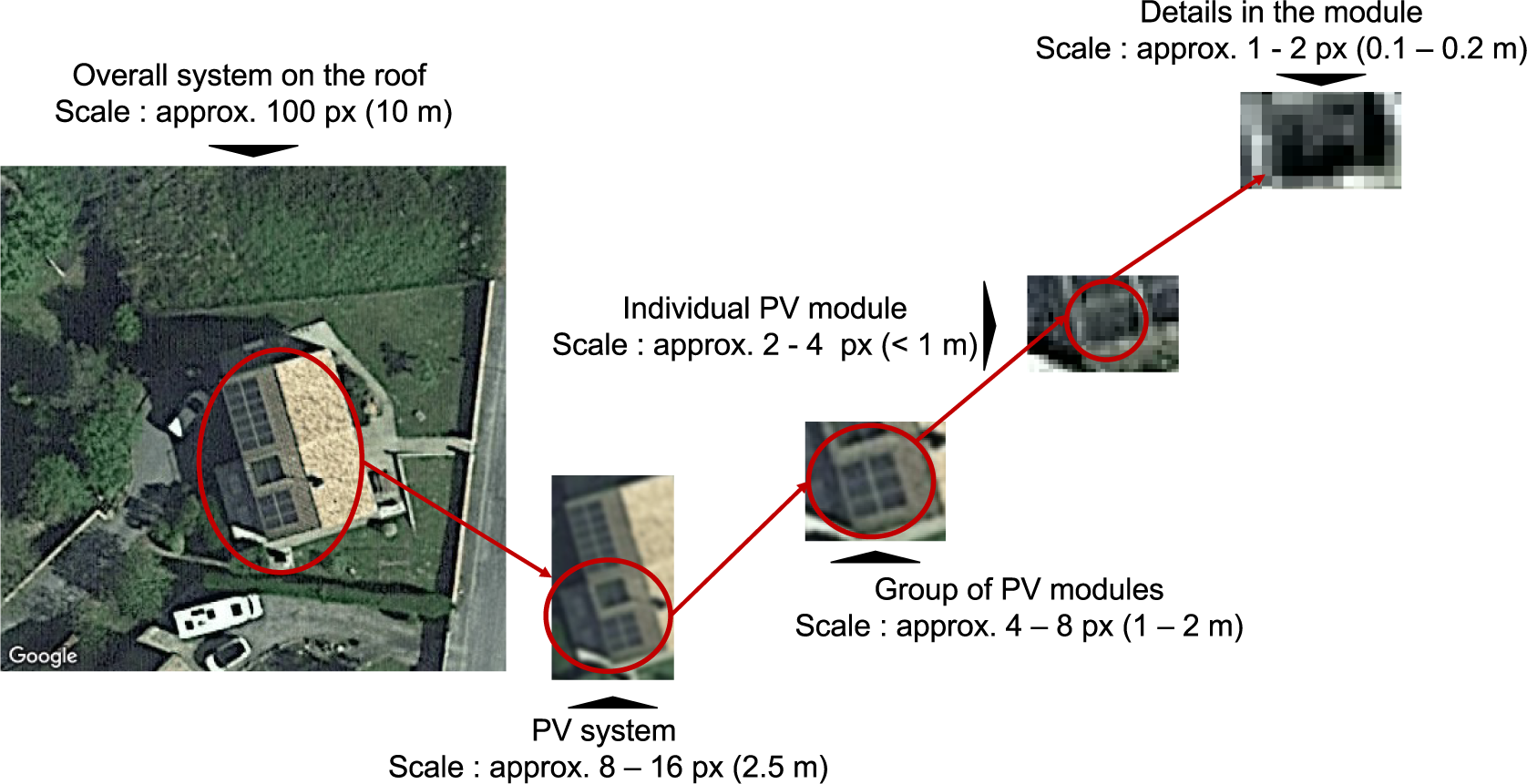
Figure 2. The same PV installation, read at different scales: the overall
system on the roof (~10 m), the array as a whole (~2.5 m), a group of modules (~1–2 m), a
single module (<1 m), and the fine grid pattern within a module (~0.1–0.2 m). A model can
latch onto any one of these — and only some of them are reliably specific to solar panels.
Source: Kasmi et al., Environmental Data Science (2025).
The clearest way to see what a model is actually keying on is to progressively strip away the
wavelet components it considers least important and watch what survives.
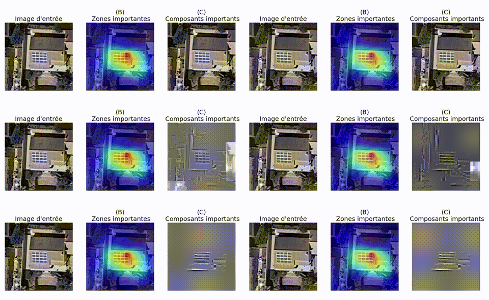
Figure 3. Input image, the model's important zones (a standard pixel-domain
heatmap), and the important components once the prediction is read in the wavelet domain. As
less relevant components are removed, what's left is the grid — not the panel as a whole.
Source: Kasmi, The Conversation (2025).
The reveal: an excellent grid detector
Running this analysis at scale across DeepPVMapper's predictions gave a clear, and slightly
humbling, answer. The model wasn't, in general, detecting solar panels. It was detecting
grids — regular, high-frequency repeated patterns at a particular scale.
Actual PV arrays have that pattern, which is why the model worked as well as it did. But so do
a number of other things: greenhouse roofs, certain skylights, corrugated roofing, solar water
heaters, parking lot shade structures. Wherever that pattern showed up, at the scale the model
had learned to key on, it fired — regardless of whether a solar panel was actually there.
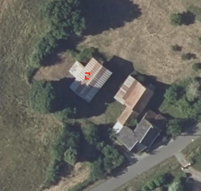
Figure 4a. A farm building roof in the Manche, flagged as a PV array. The
corrugated roofing produces the same regular, high-frequency pattern the model associates
with solar panels.
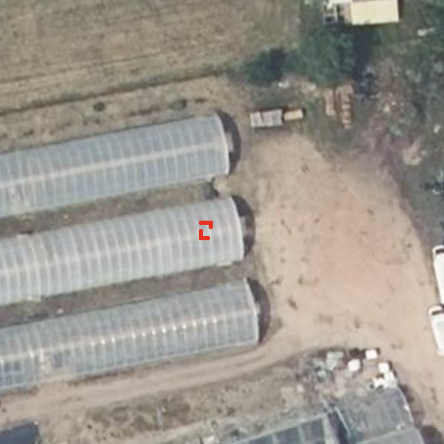
Figure 4b. Greenhouse tunnels, also flagged. Same story: a grid-like texture
at the scale the model has learned to key on. Buildings like these were common enough in the
Manche to produce a steady stream of false positives.
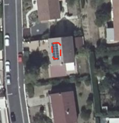
Tellingly, a genuine PV installation is picked up for the same reason — not because the model
recognizes "solar panel" as a category, but because it finds the same grid signature.
Figure 5. A correctly detected rooftop PV installation. Its wavelet-scale
signature — a regular grid at a specific scale — is what the model actually relies on here too,
which is precisely why it can't reliably tell this apart from Figures 4a and 4b.
This is a far more actionable diagnosis than "false positive rate is X%." It names the specific
visual confound driving the errors, which means it can be acted on directly: targeted
hard-negative mining on grid-textured non-PV structures, augmentation that decouples grid
texture from array shape, or an architecture change that forces the model to weigh coarse-scale
shape cues rather than fine-scale texture alone.
Circling back to accuracy, this pattern also helps interpret the sharp precision differences that
we have observed across France. As many corrugated roofing structures appear in rural areas in the North West
of France and especially in the Manche département, these roofs triggered a lot of false positives,
driving the precision down. Similarly, the fact that well defined gridded PV systems are less present
in Brittany also helps explain why the false negative rate was higher in locations
such as Morbihan or Côtes-d'Armor.
Why this matters beyond one model
None of this is specific to solar panels. Any CNN-based detector trained on a finite set of
positive examples can end up encoding a proxy feature — a texture, a repeated pattern, a color —
rather than the semantic category it's supposed to represent. Wavelet-scale attribution gives a
way to check, for a specific model and a specific prediction, which one it actually learned —
before that gap costs accuracy on data you haven't seen yet.
This example is also a reminder that the failure mode is a property of the training data, not
just the architecture. The patterns a model relies on at deployment are the patterns it was
shown during training — change what's in the training set, and different patterns can take over.
A natural fix, already explored by
Thébaud et al.,
is to explicitly train on a wider range of rooftop types, and it does improve detection on
previously mismatched building types.
But that result raises a question I don't think can be answered without checking: is the gain
coming from genuine diversity — the model learning a richer, more invariant notion of "solar
panel" — or is it a more mundane form of hard-negative mining in disguise? Adding new regions to
a training set doesn't teach a CNN anything about geography; it only changes which patterns show
up as positives and negatives. If those new regions happen to contain grid-textured non-PV
structures the original set didn't, then what looks like an improvement from geographic diversity
is really the same shortcut being patched with more examples of what to exclude — not a
different, more reliable feature.
The distinction matters because it predicts different behavior down the line. A model that has
genuinely stopped keying on the grid pattern should generalize to a new, unseen texture confound.
A model that has simply seen more instances of "grid, but not PV" will most likely fail again the
next time a genuinely novel one shows up. Wavelet-scale attribution gives a direct way to tell
the two apart — check whether the retrained model's true and false positives still share the same
fine-scale signature, or whether it has started relying on coarser, shape-based cues instead.
That's the natural next step here, and one I'd rather test than assume.
Further reading
[In French] A longer, less technical version of this argument, on how reliable and transparent
AI can support the integration of solar power into the grid, published in
The Conversation.
The full method behind this analysis, applied specifically to rooftop PV mapping: Space-scale
exploration of the poor reliability of deep learning models: the case of the remote sensing of
rooftop photovoltaic systems, published in
Environmental Data Science.
The general-purpose version of the method: One Wave To Explain Them All: A Unifying
Perspective on Feature Attribution, published at
ICML 2025
(project page).